Hidden Features; Rule Of Thumb[nail]; Dead Simple Sites
Technical, contextual, and inspirational bits away ye, dear readers, in today’s typography-centric edition of the Drop!
TL;DR
(This is an LLM/GPT-generated summary of today’s Drop using Ollama + Qwen 3 and a custom prompt.)
- Explore advanced OpenType font features like variable fonts, alternates, swashes, and contextual alternates to enhance typography (https://sinja.io/blog/get-maximum-out-of-your-font)
- Choose clean, bold sans-serif fonts for thumbnails to ensure readability and impact, while aligning with your content’s identity (https://www.creativebloq.com/design/fonts-typography/the-best-fonts-for-thumbnails)
- Discover minimalistic web design inspiration through Dead Simple Sites, a curated gallery of elegant, no-frills websites (https://deadsimplesites.com/)
Hidden Features

Most readers are very likely aware that high-quality fonts, especially those built on the OpenType standard, come packed with features that go far beyond just offering different weights or italics. Understanding and using these features can dramatically improve the polish, readability, and visual interest of your typography. Oleh Korniienko takes us on a tour of all of that in “Features of your font you had no idea about” (including generous portions of super helpful CSS to help us take full advantage of them).
NOTE: Longtime readers should likely just hit Oleh’s site, as the below is a mix of a massive summary of things we’ve already covered over the past 3!! years, with some new bits from the aforelinked post.
As we have covered quite a bit, variable fonts are a major innovation, allowing a single font file to contain multiple axes-such as weight (wght), width (wdth), slant (slnt), italic (ital), and optical size (opsz). Designers can even add custom axes, giving you fine-grained control over the font’s appearance. For common axes, use dedicated CSS properties like font-weight or font-stretch. For custom axes, you’ll need to use the font-variation-settings property. However, be cautious: directly setting font-variation-settings on an element overrides inherited values, so if you need to control multiple axes, you must specify them all at once or use CSS variables to manage inheritance.
Many fonts also include alternates-alternative glyphs for certain characters. Stylistic alternates (salt) can globally change the look of letters, while stylistic sets (ss01, ss02, etc.) and character variants (cv01, cv02, etc.) target specific subsets or individual characters. These can be enabled using OpenType feature settings in CSS, but again, inheritance can be tricky and sometimes requires workarounds with CSS variables.
Swashes are decorative flourishes found in some fonts, often used to add flair to titles. Like stylistic alternates, they can be toggled via OpenType features in CSS.
Numerals are another area where OpenType fonts provide some welcome extra capabilities. You can choose between lining or old-style numerals, and between tabular or proportional spacing. Tabular numerals are ideal for tables, chart axes, and financial data, as they align vertically, while proportional numerals blend more seamlessly into body text. Use the font-variant-numeric property to control these features.
Small caps are a special variant of lowercase letters designed to match the height of uppercase letters. They are less visually jarring than full capitals in body text. Enable them with the font-variant-caps property. If your font lacks true small caps, browsers will synthesize them from uppercase letters, but you can disable this fallback if needed.
Contextual alternates are perhaps the most seamless feature: they automatically adjust glyphs based on surrounding characters, improving legibility and aesthetics without any manual intervention. This feature is usually enabled by default but can be controlled with the font-variant-ligatures property.
These features only scratch the surface of what OpenType offers-ornaments, fractions, ordinals, and historical forms are also possible. The key takeaway is that modern fonts are powerful tools. By exploring and enabling their advanced features, you can achieve a much more refined and expressive typographic result.
Rule Of Thumb[nail]

While I do make videos for work and self, I do not do much “post-production” work, and am (thankfully) not in charge of marketing any of it. One aspect I have never given much conscious thought to (before) was how critical the “thumbnail” is — especially the text that appears on it. I’m focusing mainly on video thumbnail font choice in this mid-section, but I think many of the same points I’ll be making apply in other contexts, such as opengraph images (a.k.a. “twitter cards”) that exist to help encourage folks to engage in other content we produce.
Thumbnails create first impressions and grab attention in crowded feeds. Font choice directly impacts everything about how viewers perceive our content. When thumbnails appear at petite dimensions, text must be instantly readable even on mobile devices. Clean, bold sans-serif fonts like Arial, Helvetica, or Montserrat remain legible when reduced and avoid the muddiness that often affects ornate or serif fonts at small sizes. The font is frequently the most prominent element in a thumbnail, and a clear, eye-catching typeface helps your video stand out while increasing click-through rates. Fonts with strong visual presence, such as Bebas Neue or Poppins, create impact that attracts viewers scrolling through content feeds.
Your chosen font should reflect your content/channel’s identity and content tone. Consistent font usage reinforces your brand (ugh, sorry to have to use that word) and makes videos immediately recognizable, helping build channel recognition over time. Playful channels might use rounded, friendly fonts, while tech channels frequently prefer modern, minimalist options that align with their content style. The right font ensures quick, effective message communication within seconds — critical since viewers make watching decisions almost instantly. Overly decorative or complex fonts can obscure your message and reduce engagement because viewers simply won’t understand what your content offers.
Using too many fonts or styles creates thumbnail clutter and confuses viewers. Limiting yourself to one or two complementary fonts maintains a clean, focused design that viewers can process quickly without distraction. As João Vitor (a recognized industry expert) notes, “Thumbnails are like a billboard for your video-they’re the first impression viewers get. When your thumbnail text is clear, eye-catching, and aligned with the video’s tone, it gives people a reason to stop and consider watching.” This captures why font selection matters so much – in a crowded content landscape, your thumbnail font helps determine whether viewers pause long enough to consider clicking, or simply scroll past to the next option.
“The best fonts for thumbnails” is def one of those “I’m just going to make a big list of things to reach the character limit required by my freelance contract” posts, but does provide a super nice selection of fonts you can use for thumbnails.
Dead Simple Sites
We won’t belabor this final section. As I’ve noted many times, I am in the “needs inspiration” camp when it comes to design, and that goes as much for webby-thingies as it does for my other chartistic endeavors.
Dead Simple Sites, in their own words, has:
- The most minimal sites on the web, curated in one place.
- No overly animated content.
- No scroll jacking.
- No excessive storytelling.
- Less, but better. Updated weekly.
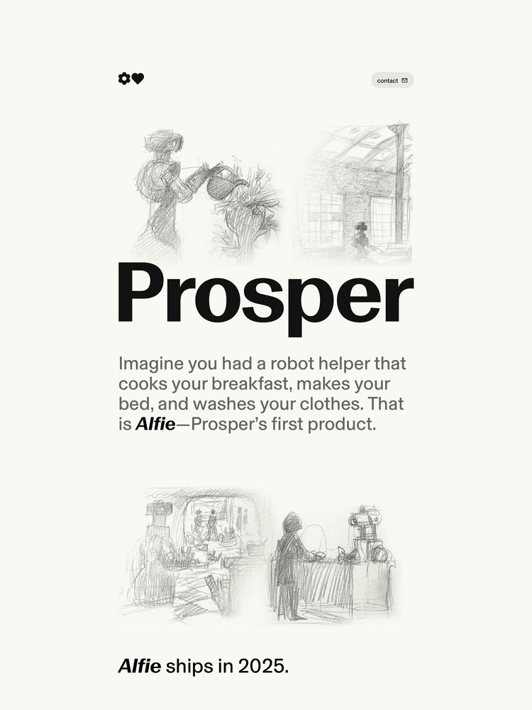
It’s a gallery of minimal but gorgeous sites, curated by the folks at Arcade Labs. The vast majority take extra care when it comes to typography (hence the inclusion). Tap on any thumbnail (the one in the section header is https://prosper.org/) to go directly to the referenced site. Once there, you can just “view the source, luke!” (the water woes mentioned on Monday prevented a pretty fun Star Wars Day Bonus Drop, so figured I’d get that in today).
FIN
Remember, you can follow and interact with the full text of The Daily Drop’s free posts on:
- 🐘 Mastodon via
@dailydrop.hrbrmstr.dev@dailydrop.hrbrmstr.dev - 🦋 Bluesky via
https://bsky.app/profile/dailydrop.hrbrmstr.dev.web.brid.gy
☮️

Leave a comment