Typographic “Infrastructure”; FontDiffuser; Featured Free Font: Costaline
Some nerdy typographic bits in today’s typography-centric edition of the Drop, with a special focus on something we rarely discuss: font “infrastructure”.
TL;DR
(This is an LLM/GPT-generated summary of today’s Drop using Ollama + llama 3.2 and a custom prompt.)
I made no prompt changes but got this slightly different result. Odd. I’m going to try switching to Qwen 3 for a bit to see how it performs.
- FontDiffuser approaches font generation as a noise-to-denoise process using a conditional diffusion model with three innovations: Multi-scale Content Aggregation (MCA) Block, Reference-Structure Interaction (RSI) Block, and Style Contrastive Refinement (SCR) Module, which consistently outperformed state-of-the-art methods across all complexity levels https://yeungchenwa.github.io/fontdiffuser-homepage/
- IKEA’s typographic journey highlights the importance of infrastructure decisions in typography, from pivoting to Verdana and Noto Sans to self-hosting fonts and variable fonts, balancing performance constraints, legal considerations, and consistent rendering. IKEA’s typographic journey
- Costaline is a contemporary serif typeface that combines modern elegance with classic elements, offering multiple weights with both upright and italic styles, ligatures, multilingual support, and variable font versions. Costaline
FontDiffuser
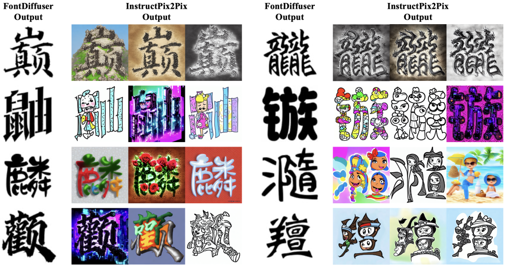
FontDiffuser is (yet-another?) diffusion-based framework that creates new fonts by combining the style from a reference image with content from a source image. It specifically addresses challenges in generating complex characters and handling significant style variations — persistent problems in automatic font generation, especially for languages with large character sets such as Chinese, Japanese, and Korean.
Traditional font generation methods typically separate style and content representations before recombining them to create new characters. Many use Generative Adversarial Networks (GANs), which, despite their effectiveness, often face unstable training and struggle to preserve fine details in complex characters. Some methods require manually annotated information like character strokes, which is labor-intensive for complex scripts. While prior-free methods exist, they frequently produce missing strokes, artifacts, and inconsistent styles, particularly with substantial style variations or unfamiliar characters.
FontDiffuser approaches font generation as a noise-to-denoise process using a conditional diffusion model with three clever innovations:
- Multi-scale Content Aggregation (MCA) Block: Extracts and integrates global and local content features from different scales into the UNet backbone. This preserves intricate stroke details and structural elements critical for complex character generation. Large-scale features capture fine details, while small-scale features provide layout information.
- Reference-Structure Interaction (RSI) Block: Addresses structural differences (font size, deformation) between source and reference images using deformable convolutional networks enhanced with cross-attention mechanisms. This enables the model to learn and apply structural transformations based on reference features, improving alignment and accuracy.
- Style Contrastive Refinement (SCR) Module: Enhances style transfer across variations by separating style representations using a VGG-based style extractor. It guides the diffusion model through a contrastive loss that encourages generated characters to match target styles while remaining distinct from negative samples. This ensures robust style imitation at global and local levels.
Training occurs in two phases: – First phase: Training with mean squared error diffusion loss, focusing on content reconstruction. – Second phase: Introduction of the SCR module and style contrastive loss to guide style learning.
Data augmentation techniques such as random cropping and resizing improve robustness during style contrastive learning.
FontDiffuser was evaluated on a large Chinese font dataset, testing its ability to generate characters of varying complexity and to handle unseen fonts and characters. Metrics included FID, SSIM, LPIPS, and L1 loss, alongside studies in meatspace. The framework consistently outperformed state-of-the-art methods across all complexity levels, showing superior content preservation, style consistency, and structural accuracy. Its advantage was most notable with complex characters and large style variations.
Ablation studies confirmed each module’s effectiveness: MCA improved stroke preservation, RSI enhanced structural alignment, and SCR strengthened style transfer. The model demonstrated cross-lingual generalization by successfully generating Korean characters using a model trained on Chinese data.
Despite its strengths, FontDiffuser, like most diffusion models, has slower inference compared to GAN-based methods, even when using efficient samplers like DPM-Solver++. Nevertheless, its ability to produce high-quality, stylistically accurate, and structurally faithful characters for complex scripts represents a significant advancement in automatic font generation.
As we edge even closer to halfway-decent AI-crafted fonts, I hope that doesn’t do what almost every other industrial advancement has done, which is to “downgrade” the humans that should always be in the loop of creative endeavors.
Typographic “Infrastructure”
We typography nerds generally focus on aesthetics and design principles, but behind every beautiful typeface lies complex infrastructure decisions that make using fonts consistently (with adequate “performance” from a reader’s perspective) possible. IKEA’s typographic journey offers a spiffy case study in how technical constraints shape visual identity in our digital world.
For decades, IKEA’s visual identity was inseparable from Futura, which graced their iconic catalogs since the 1950s. However, the all consuming move to the internet by, well, everyone, exposed Futura’s limitations — it came standard only on Macs, forcing their web presence to default to Arial on most devices and creating jarring inconsistencies between digital and physical materials.
In 2010, IKEA pivoted to Verdana, Microsoft’s screen-optimized font. This practical choice leveraged Verdana’s widespread availability through Microsoft’s “core fonts for the web” initiative. Yet as IKEA expanded into Thailand, South Korea, and Arabic-speaking markets, Verdana’s limited language support (covering only Latin, Greek, and Cyrillic scripts) fractured their global visual identity.
Enter Google’s Noto Sans — designed with the ambitious goal of supporting every character in every language. IKEA’s customized version, “Noto IKEA,” solved their multilingual needs but created new deployment challenges. How could they efficiently deliver a custom font without slowing down their websites?
Their initial solution was ingenious yet problematic: they base64-encoded only the modified characters into their CSS, with fallbacks to standard Noto Sans and generic sans-serif fonts. Unfortunately, this approach collided with evolving browser privacy policies that limited caching effectiveness, while CSS requests became performance bottlenecks and GDPR rulings raised concerns about relying on Google Fonts.
IKEA’s next evolution — self-hosting their fonts — reveals the sophisticated infrastructure beneath modern typography. They standardized on the compact WOFF2 format, chunked fonts into Unicode ranges, and stripped unnecessary features to minimize file sizes. Most folks now download just three small files totaling under 30KB for Latin-script pages — a remarkable achievement for global brand consistency.
Behind the scenes, IKEA’s design system team employed specialized tools like subset-font (built on Harfbuzz) and fonttools, while implementing automated visual regression testing with Playwright to ensure consistent rendering across platforms — infrastructure most typography enthusiasts never see.
Even IKEA’s experiments with variable fonts highlight the technical balancing act. While these flexible fonts promised both design versatility and efficiency, testing revealed they only delivered file size benefits in markets with extensive character sets like Chinese, Japanese, and Korean.
The typography world often celebrates the visual artistry of fonts, but IKEA’s journey reminds us that in today’s global, multi-platform landscape, the hidden technical infrastructure of typography — balancing performance constraints, legal considerations, and consistent rendering — is just as crucial as the curves and counters we admire.
Featured Free Font: Costaline

Costaline, created by Megatype, is a contemporary serif typeface that combines modern elegance with classic elements. The font features harmonious natural curves, slightly swollen stems, and graceful slants that become more pronounced in heavier weights. Lighter styles have lower contrast and optical adjustments, giving them a warm, soft appearance.
It offers multiple weights with both upright and italic styles, with italics carefully matched to their corresponding weights. It includes OpenType features such as ligatures and multilingual support. The typeface also provides variable font versions for both regular and italic styles, enhancing its versatility across various design applications.
The font is a bit too refined for use in the Drop, but it’s a great tool to have in the font toolbox.
FIN
Remember, you can follow and interact with the full text of The Daily Drop’s free posts on:
- 🐘 Mastodon via
@dailydrop.hrbrmstr.dev@dailydrop.hrbrmstr.dev - 🦋 Bluesky via
https://bsky.app/profile/dailydrop.hrbrmstr.dev.web.brid.gy
☮️

Leave a comment