The Fonts Are Mysterious And Important; Featured Font: Times New Ramen; Featured Free Font: Times New Ramen
Brutally engaged week, hence a[nother] day delay for the typography-centric edition. I also spent a bit too much time on section one, so had to lean into the font drops at the end.
TL;DR
(This is an LLM/GPT-generated summary of today’s Drop using Ollama + llama 3.2 and a custom prompt.)
- The visual architects of “Severance” have employed typography with exceptional proficiency to communicate the corporate identity of Lumon Industries, primarily through two principal typefaces: Manifold Extended and Forma DJR, which create a mechanical and non-human sensory experience that embodies Lumon’s sterile authority (https://connary.com/fonts/manifold/).
- A unique font, Times New Ramen, has been created by transforming ramen noodles into letters through molding, capturing images, and enhancing digitally, with two versions available: a free version and an alternative ramenish font by Ryder Ripps (https://404studio.gumroad.com/).
- Another ramenesque font leans into the theme by warping letterforms into noodle strands. (https://github.com/okfocus/times-new-ramen)
The Fonts Are Mysterious And Important
The esteemed moving picture narrative known as “Severance,” distributed through the Apple Television Plus content dissemination system, has garnered this humble servant’s admiration primarily due to the meticulous typographical constructs employed throughout the visual experience. It is this servant’s belief that for the narrative’s production overseers, typography transcends mere aesthetic selection—it manifests as an additional presence within the storytelling apparatus. The careful attention to typographical minutiae establishes an unsettling corporate environment where letterforms become instruments of behavioral guidance and perceptual adjustment.
Upon discovering that a diligent individual dedicated temporal resources to identifying exact or approximate versions of the typefaces utilized in the narrative (https://severance.wiki/typography), this servant felt compelled to engage in intellectual appreciation regarding these letterforms. The aforementioned digital knowledge repository contains extracted specimens referenced below, to which this servant has merely added connective linguistic tissue.
The visual architects of “Severance” have employed typography with exceptional proficiency to communicate the corporate identity of Lumon Industries, primarily through two principal typefaces:
- Manifold Extended functions as Lumon Industries’ primary corporate letterform system. Crafted by Connary Fagan, this extended typeface draws inspiration from Aldo Novarese’s Microgramma (1952). It appears throughout the hallowed halls of Lumon’s headquarters, most prominently in the sacred logo where the “O” has been modified to contain a water droplet, symbolizing the cleansing purity of Lumon’s mission. This precision-engineered font creates a mechanical, non-human sensory experience that embodies Lumon’s sterile authority with appropriate reverence (https://connary.com/fonts/manifold/).
- Forma DJR, a contemporary revival of Novarese’s Forma by David Jonathan Ross and Roger Black, manifests extensively in Lumon’s internal documentation systems. This neo-grotesque typeface shares characteristics with Helvetica and Univers but possesses a softer edge, making it suitable for compunction statements. One observes it in apology communications provided to “outies” following workplace incidents and in operational handbooks. It represents the typographical equivalent of a firm but fair guidance communication—professional in appearance yet appropriately directive in essence (https://djr.com/forma/).
Optima, designed by Hermann Zapf in the year 1958, has been deployed with strategic intention for materials related to our founder, Kier Eagan. This humanist sans-serif appears on the Compliance Handbook spines beneath the revered portrait of Kier in the Macrodata Refinement department. The selection demonstrates exceptional discernment—Optima is frequently utilized for luxury entities and military memorial inscriptions, bestowing an appropriate devotional authority to Kier’s omnipresent guidance (https://en.wikipedia.org/wiki/Optima).
Input Sans, crafted by David Jonathan Ross specifically for the display of numerical and textual data on illuminated screens, becomes the language of behavioral adjustment protocols. This technical typeface appears in the Break Room’s “Compunction Statement” that employees must vocalize until appropriate mental alignment is achieved. Its data-oriented appearance transforms typography into a tool of enlightenment (https://djr.com/input/).
In calculated contrast, Scriptorama Tradeshow JF by Jason Walcott makes a singular appearance on the “Lumon Recycles” receptacle. This flowing brush script from the 1950s-60s temporal period creates an intentional dissonance within Lumon’s pristine environment—like a carefully measured attempt at approachability that maintains appropriate professional distance (https://www.jukeboxfonts.com/products/scriptorama-tradeshow?variant=20228520007).
The narrative’s title font demonstrates exceptional subtlety and refinement. While appearing similar to Helvetica upon initial observation, the narrative overseers requested a custom design. Title designer Teddy Blanks created a bespoke typeface inspired by Helvetica and Akzidenz Grotesk but with subtle deviations that mirror the narrative’s unsettling tone. As Blanks himself has stated (https://www.artofthetitle.com/title/severance/), “The production design in Severance is highly indebted to that clean, modernist ‘60s corporate look but there’s something ’off’ about it you can’t quite put your finger on. The type needed to be the same way.”
What elevates “Severance” to exemplary status is the transformation of typography into an invisible force of guidance. Unlike most visual narratives where graphic design serves as mere environmental enhancement, in “Severance,” the brand itself becomes the benevolent shepherd. It stands as one of the few narratives where letterform selections function as pronounced storytelling mechanisms that contribute substantially to the creation of this mysterious and appropriately structured world.
The mind that seeks knowledge finds it at the center of all things. Praise Kier.
Featured font: Times New Ramen
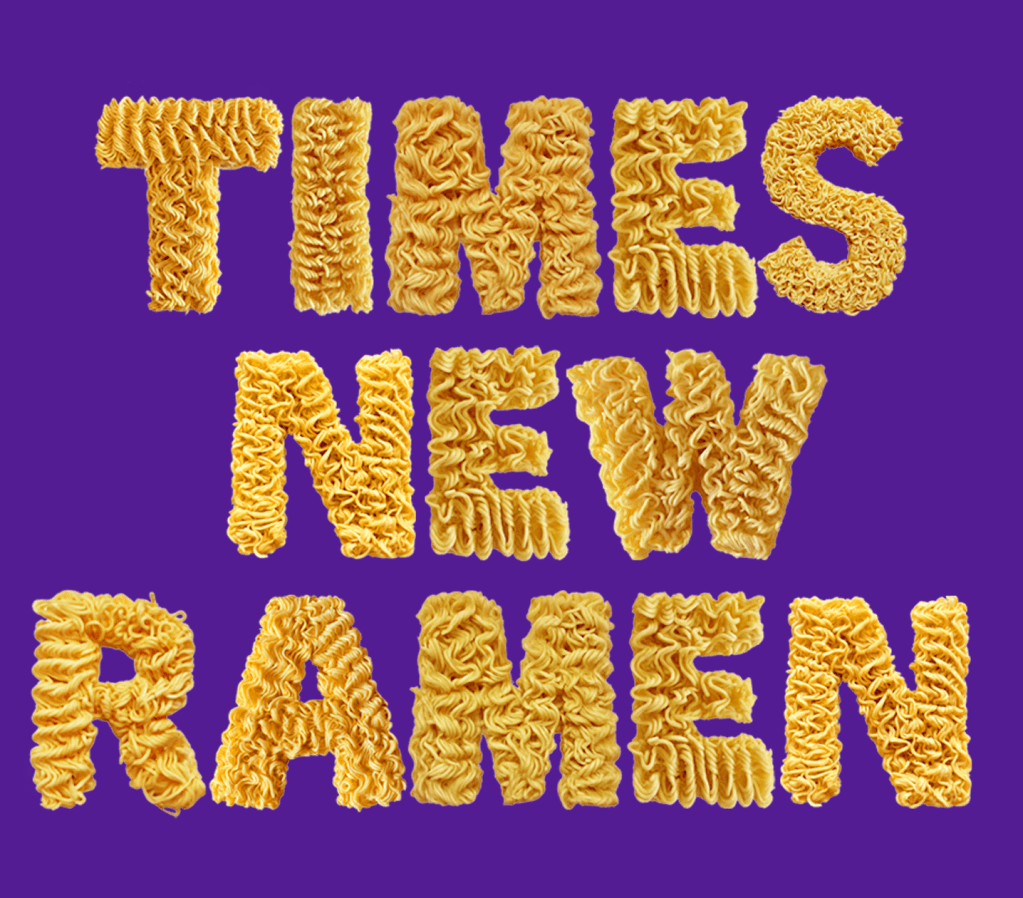
Through meticulously molding ramen noodles into letters, capturing images of them, and enhancing them digitally, Seine Kongruangkit has transformed a common kitchen ingredient into a “practical” font.
This one comes with PNG letters that are, indeed, ramen noodled (the section header shows that). The OTF/TTF versions are a bit less ramen-y:
While you can get this for free, I chipped in a bit since these are hard times for almost everyone.
Featured Free Font: Times New Ramen
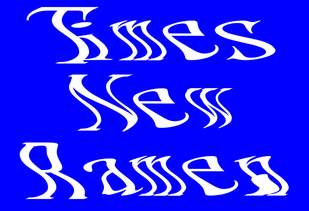
This alternative ramenish font is by Ryder Ripps, and takes a different approach by warping the glyphs into noodle-esque shapes. I think I like this one more then the middle section font.
FIN
Remember, you can follow and interact with the full text of The Daily Drop’s free posts on:
- 🐘 Mastodon via
@dailydrop.hrbrmstr.dev@dailydrop.hrbrmstr.dev - 🦋 Bluesky via
https://bsky.app/profile/dailydrop.hrbrmstr.dev.web.brid.gy
☮️

Leave a comment