VT220 4EVA; TypogrAIphy; Featured Free Font: MS Scratch
I had a feeling this was going to be a bad [democracy] week and it sure has been. We’ll try to make up for the missed Drops this weekend, but I can’t let the week go by without a typography one.
TL;DR
(This is an AI-generated summary of today’s Drop using Ollama + llama 3.2 and a custom prompt.)
- The VT220 terminal’s unique typography resulted from hardware-level rendering processes, including “dot stretching” to compensate for CRT phosphor limitations (https://martin.janiczek.cz/vt220-font-emulation/)
- Creative Fabrica’s AI Font Generator creates custom, installable TTF fonts using diffusion models and “inter-elemental style consistency” techniques, available free until month’s end (https://www.creativefabrica.com/tools/font-generator/)
- MS Scratch is a human-designed graffiti-style font with intentional distortions that create a “trash” aesthetic while remaining legible (https://www.fonts.net.cn/author-4671604099-1.html)
VT220 4EVA
Out modern, glowing rectangles may be gloriously thin, wonderfully bright, and packed with pixels, but nothing can replace the charm and elegance of the good ol’ CRT (that’s “cathode ray tube” for you kids out there) terminals. I suspect that’s part of the appeal of Severance (which you should absolutely watch if you do not already partake).
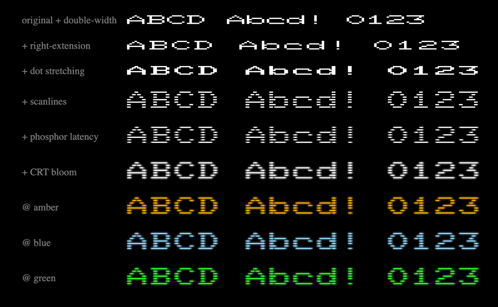
I’m partial to VT100’s, but the VT220 terminal was pretty dope, especially when it comes to text rendering. Martin Janiczek’s browser-based emulation project (GH) recreates the unique typographical characteristics of these iconic terminals by implementing the actual hardware-level rendering processes rather than simply mimicking the end result.
DEC terminal typography emerged from technical constraints rather than pure aesthetic choices. The displayed characters weren’t direct representations of pixel data from ROM (read-only memory). Instead, they resulted from adaptations necessary to overcome CRT phosphor limitations.
The phosphor’s slow activation time (compared to the 40ns pixel timing pulse) meant individual pixels would be barely visible if displayed directly. DEC engineers implemented “dot stretching” to address this issue, extending active pixels for an additional duration. This transformed the original 8×10 matrix into a 9×10 display matrix, creating the distinctive appearance users recognized.
The VT220 also featured gaps between scan lines, effectively doubling character height. This combination of horizontal stretching and vertical spacing produced a unique typography impossible to recreate without understanding the underlying technical processes.
Janiczek’s project implements the rendering algorithms in JavaScript rather than simply creating another pixel font based on ROM data. The dot stretching circuit was crucial in this process, extending single lit pixels by one position to compensate for phosphor rise time.
The VT220 stored 288 built-in glyphs in ROM as 8×10 pixel matrices, including ASCII characters, DEC Supplemental set, Display Controls, and DEC Special Graphics. Without the rendering transformations, these would have appeared too thin for legibility on CRT displays. This terminal typography became familiar to a generation of computer users and continues to inspire nostalgia and recreation efforts.
Unlike other terminal font recreations focused solely on raw bitmap data, Janiczek’s project acknowledges the critical technical factors that shaped on-screen appearance, including phosphor effects and the distinctive scan line presentation that defined the DEC terminal aesthetic.
It’s a super neat project to dig into, too, as it is written in Elm (which, as I bemoaned way back in 2023, I really need to cover in a Drop, soon). There’s also a slight chance Martin might port this to WebGL, so keep an eye out on the repo.
TypogrAIphy
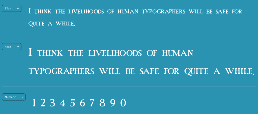
Creative Fabrica’s Font Generator has an AI-based online tool (which folks can try for free until the end of the month) that lets us generate custom, installable fonts (yes, it makes TTF files vs. just images) in various styles including serif, script, and sans serif.
It uses a diffusion-based architecture that was trained on hundreds of thousands of typefaces, and employs both text-to-image and image-to-image models enhanced by what they refer to as “inter-elemental style consistency technique” to ensure coherence across all characters in a font.
In the context of AI, particularly generative AI models focused on design and visual content creation, “inter-elemental style consistency technique” refers to methods that ensure stylistic coherence across different elements within generated content. This concept involves style transfer across elements, which ensures generated elements share consistent stylistic properties). It also helps maintain appropriate stylistic relationships between elements while allowing for intentional variation where needed. The goal is to create a unified aesthetic where all generated elements appear to belong to the same design system — “appear” is doing quite a bit of heavy lifting in that part, as you’ll see if you do use this tool. In theory, this method should eliminate the jarring effects of inconsistent styling that make AI-generated content feel disjointed or unprofessional (kind of like the fonts this tool makes).
The system also incorporates font-specific textual descriptors that enable precise prompting for the generative models.
They bill this as a “democratization of font creation”, but I think human typographers won’t be in bread lines anytime toon (at least not due to AI-generated fonts). AI font creation systems will surely evolve and eventually start to generate high-grade, usable fonts. Even then, I will gladly drop coin for human-curated fonts vs try to get lucky with yet another creation from our digital infinite monkeys (which is what both AI narrative and AI code generation feels like right now).
Featured Free Font: MS Scratch

Unlike the garbage created by the tool in the midsection, MS-Scratch (use Kagi or some other translator if you cannot grok Simplified Chinese) is great example of human-designed contemporary typography that does a create job evoking a specific aesthetic sensibility. It’s a graffiti-style typeface that deliberately/carefully incorporates distortion and irregularity to create what might be described as a “trash” aesthetic.
The font’s characters feature scratched surfaces and deformed shapes that produce a mysterious, antiquated appearance. Despite these intentional distortions, the font is still legibile.
While it’d be great to use in any context where one might lean into a said graffiti vibe, I can also see some interesting uses of this in scrollytelling and datavis annotations, depending on the subject.
FIN
Remember, you can follow and interact with the full text of The Daily Drop’s free posts on:
- 🐘 Mastodon via
@dailydrop.hrbrmstr.dev@dailydrop.hrbrmstr.dev - 🦋 Bluesky via
https://bsky.app/profile/dailydrop.hrbrmstr.dev.web.brid.gy
Also, refer to:
to see how to access a regularly updated database of all the Drops with extracted links, and full-text search capability. ☮️

Leave a comment