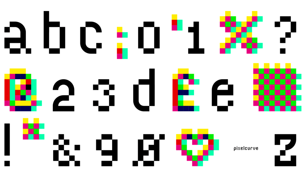
Bored Ape Font Club; Ten Typography Talks Of 2024; Featured Foundry: atipro
Tis the final Typography Tuesday of 2024!
We’ve got a massive “look back” section in the middle that will give you tons of content to keep you occupied for at least a few weeks in 2025; a look at an novel concept to help type designers get paid; and, an introduction to a phenom foundry with plenty of free downloads to keep you busy for a few days.
TL;DR
(This is an AI-generated summary of today’s Drop using Ollama + llama 3.2 and a custom prompt.)
- NFType introduces blockchain-based unique font ownership system where designers earn ongoing royalties from resales, with prices ranging from 150to150to50,000 (https://www.nfty.pe/#faq)
- Letterform Archive curated 24 typography presentations in 2024, with ten notable talks covering topics from data visualization to historical type revival (https://letterformarchive.org/news/ten-type-talks-to-revisit-from-2024/)
- Spanish foundry atipo offers distinctive typefaces like Bariol, Calendas, and Cassannet with a pay-what-you-want model and free single weights (https://www.atipofoundry.com/fonts/bariol)
Bored Ape Font Club
Chatter around NFType grew in 2024 (though non-designers, and folks who rarely shell out coin for glyphs may not have come across it), so it’s fitting we finally take a (brief) look at it in this end-of-year typographical look-back.
Craig Ward — a pretty famous director and typographer in design circles — believes we “need” to change how we think about fonts by making each one special and unique. How unique? Imagine if every letter you typed was slightly different from anyone else’s — that’s what NFType does. They use special computer programs to create fonts where no two sets of letters are exactly the same, and they keep track of who owns each font using the same kind of technology that powers Bitcoin.
When someone buys a font from NFType, they become its only legal owner (like the silly NFT images, et al.). The system uses smart contracts (digital agreements that can’t be changed) to make sure everyone knows who owns what and to handle payments automatically. They only make 1,000 versions of each font to keep them special/create scarcity. While you can buy the fonts with regular money at first, if you want to sell your font later, you’ll need to use special online marketplaces.
The cost of these fonts depends on how big your company is. A small business might pay between 150and150and2,500, while large companies could pay up to $50,000. What makes NFType different is that the font designers keep getting paid whenever their fonts are resold or when they bring in new customers — kind of like getting royalties for a song, but for letters instead.
In theory, this “innovation” has some potential for good, as font designers can earn money over time instead of just getting paid once. Plus, NFType claims to plant trees to offset the carbon footprint of maintaining this blockchain.
Even though NFType tries to make each font exclusive, digital files can still be copied. Some people might find the fonts too expensive, and not everyone is comfortable with the blockchain technology it uses. Also, having only 1,000 versions of each font might make it hard for some industries that need everyone to use the same exact font.
NFType shows us a new way of thinking about how designers can make money from their work. While it’s an intriguing idea, some folks (/me raises hand) are still unsure about using blockchain technology at all, let alone in this context.
We’ll see if the buzz continues in 2025+, or if we’ll be in an “all my fonts gone” situation.
Ten Typography Talks Of 2024

In 2024, Letterform Archive curated a series of 24 presentations related to typography and graphic design. These sessions, encompassing both online and in-person events, offered insights into both design history and contemporary practices. For folks who might have missed them, the Archive has highlighted several noteworthy talks that are now available for viewing. You can find the list, below, right on the site, but I’ve got some extra commentary for ones I took notes on, and have links to ones with subjects we’ve covered in previous Typography Tuesdays.
The first is “Compared to What?” by data storyteller RJ Andrews. In this talk, Andrews examines how masterful data graphics employ shapes and letters to derive meaning from data.
This goes far beyond mere labeling. Historical examples from the 17th to 20th centuries demonstrate how typographic hierarchies can reinforce data relationships and create meaningful distinctions. The integration of text with graphical elements, such as flowing labels along data curves or using color-coordinated type, enhances comprehension and creates visual harmony. Andrew also asserts that analog printing processes ironically offered more experimental freedom and diversity in typographic expression compared to modern digital tools (it’s a fair argument, but I’m not 100% convinced). The collaborative nature of traditional printing processes often led to superior design outcomes, as multiple perspectives refined the work. Modern data visualization benefits from thoughtful type selection and placement, whether using position, color, or shape to establish information hierarchies. While digital tools may create certain constraints, understanding historical approaches to typographic integration can inform more effective contemporary visualization design.
Next up is “Make Icons Editable, Animated, and Colorful with Font Technologies,” led by Wenting Zhang, co-founder of Typogram. This presentation explores innovative methods to make icons customizable, animatable, and recolorable by leveraging variable font and color font technologies.
Variable fonts and color fonts represent significant advancements in typography technology, particularly for icon design and animation. They give designers the power to create icons that can morph between states using custom axes, including a time axis for animation control. Color fonts enable multiple layers within a single glyph, supporting two-tone or multi-colored designs with transparency options. By using all the rich features of variable fonts, we can potentially eliminate the need for messy/complex CSS and JavaScript code.
Leah Spencer’s talk, “Type Revival for Period Film & TV,” (covered in a previous Drop) provides a behind-the-scenes look at her process for replicating period-appropriate typography for productions such as “The Marvelous Mrs. Maisel.” Her insights shed light on the meticulous work involved in bringing historical typefaces to life on screen.
In celebration of Pride Month, the Archive’s Collections Team — comprising Eve Scarborough, Jada Simone Haynes, and Mikhail of Hearts — presented “Salon Series 49: A Seat at the Table: Queer*+ Intersections.” This session features a curated selection of works by Queer*+ designers, highlighting their contributions to the design community.
Francisco Roca introduced audiences to the evolution of a young book cover designer who rose to prominence in 1960s Argentina, Latin America, and Spain in his talk titled “A Certain Cotta: Book-Cover Design from Buenos Aires.” This presentation offers a glimpse into the designer’s journey and impact on book cover aesthetics. (I have not viewed this yet.)
Tim Ripper’s session, “The Past Inside the Future: Commercial Classics at Five,” focuses on one of the most intriguing periods in type history and discusses how it inspired the creation of a new foundry. Ripper’s exploration provides context on the interplay between historical influences and modern type design.
Ripper focused on three main projects: Successor (a reinterpretation of English Egyptian typefaces), an ornamental revival, and St. Francis (based on French calligrapher Jean-Miedel’s work). The lecture explored how Industrial Revolution-era typography responded to new printing technologies and economic changes, with type becoming bolder and more varied to stand out in increasingly crowded advertising spaces. Ripper discussed the challenges of adapting historical typefaces for modern use while maintaining their essential character, and how digital technology enables new possibilities like color layering and animation. He emphasized that the goal isn’t historical accuracy but creating convincing, usable typefaces that connect past and present.
Richard Danne shared images and anecdotes from his unique, six-decade career during the in-person book launch event titled “Richard Danne Goes Airborne With ‘Stars’ Launch!” This presentation offers personal insights into Danne’s contributions to design, including his work on the NASA logo and design program. (I have not viewed this yet.)
Anne Galperin’s research presentation, “The Women of Photo-Lettering,” uncovers the often overlooked contributions of women in phototype design, with a particular focus on Betti Haft. Galperin’s findings shed light on the significant yet underrecognized roles these women played in the evolution of typographic design.
Women’s contributions to typography and graphic design were often uncredited or obscured, with their work frequently attributed to studio heads or male colleagues. From the hundreds of contributors to the 1971 Photo Lettering Manual of Styles, only a scant handful were women, highlighting the gender disparity in the field.
There were also many obstacles in their paths, such as having to take hybrid roles combining design with administrative work, receiving less recognition after marriage, dealing with male-dominated studio environments, and navigating complex technological transitions from manual to digital processes.
Galperin’s research emphasizes that design history isn’t just about the final products, but about the people who created them, their struggles, and their triumphs in shaping visual communication.
In “Printing the Message for the People: The Making of Citizen Printer,” Amos Paul Kennedy, Jr., and Lucie Parker discuss their collaborative journey in bringing a monograph to life. Their conversation provides insights into the creative and production processes behind the publication.
Kennedy left a corporate career at AT&T to become a letterpress printer after being inspired by a printing demonstration at Colonial Williamsburg. He creates posters and art prints focused on social justice, African American history, and community engagement.
Key aspects of Kennedy’s work:
- Uses “bad printing” techniques intentionally, embracing imperfection and variation
- Works primarily with wood type and creates layered, multicolor prints
- Focuses on African American voices, civil rights messages, and social justice themes
- Prints on chipboard and other accessible materials
- Operates independently from his Detroit studio
- Collects and repurposes historical printing materials, including controversial racial imagery
The book “Citizen Printer” documents Kennedy’s work and philosophy. He defines being a “citizen printer” as someone actively engaged in governance and community through their printing practice.
The lecture included discussions of Kennedy’s artistic process, his transition from corporate work to printing, and his views on social justice and community engagement. It concluded with audience Q&A covering topics like his work process, musical preferences while printing, and perspectives on skill mastery.
(The book is great, too!)
Lastly, “Salon Series 51: Piet Zwart’s NKF” features Paul Stirton and Elizabeth Meggs giving us a peek into the life and work of Piet Zwart. They examine his typographic masterpiece for a Dutch cable company, which redefined catalog design, offering perspectives on Zwart’s innovative approach and its lasting impact on design. (I have not viewed this yet.)
Featured Foundry: atipro

Atipo is an independent digital type foundry and graphic design studio located in Gijón, Spain. Founded by Raul Garcia and Ismael Gonzalez Pomar, who met while studying fine arts at Salamanca, the studio launched in 2010 during an economic crisis.
The foundry takes a unique approach to font distribution, allowing customers to download single weights of their fonts for free while offering complete font families at affordable prices. They use a “pay-what-you-want” model for many of their typefaces.
Their typeface portfolio includes several distinctive fonts, including:
- Bariol: a rounded typeface that combines elements of Helvetica and DIN, designed to be both versatile and highly readable (serif; sans)
- Calendas: a font created specifically for print use, which was expanded for Town & Country magazine.
- Cassannet: a display typeface inspired by Art Nouveau and Cassandre posters, particularly suited for editorial design.
They have generous free downloads for various styles of each font, and most are sold in a “pay-what-you-want” fashion, making them pretty accessible to everyone.
FIN
Remember, you can follow and interact with the full text of The Daily Drop’s free posts on:
- 🐘 Mastodon via
@dailydrop.hrbrmstr.dev@dailydrop.hrbrmstr.dev - 🦋 Bluesky via
https://bsky.app/profile/dailydrop.hrbrmstr.dev.web.brid.gy
Also, refer to:
to see how to access a regularly updated database of all the Drops with extracted links, and full-text search capability. ☮️

Leave a comment