Dataviz Accessibility Principles; Writing Alt Text For Data Visualization; Accessibility Assistance From AI
Today’s Drop dives into the incredibly-important-yet-often-overlooked topic of accessibility in data visualizations, focusing on the design principles, practical guidance, and emerging AI tools that can help bridge the gap for individuals with disabilities. From election dashboards riddled with usability flaws to actionable advice on writing alt text for charts, this edition highlights the importance of inclusive design. Whether you’re a dataviz creator or simply someone eager to make information more accessible, today’s resources def have you covered.
TL;DR
(This is an AI-generated summary of today’s Drop using Ollama + llama 3.2 and a custom prompt.)
- Dataviz Accessibility Principles: A study highlights widespread accessibility shortcomings in data visualizations created for the recent POTUS election, citing design flaws that limit usability for individuals with disabilities and emphasizing the need for incorporating accessibility testing throughout the design and development process (https://fossheim.io/writing/posts/2024-dataviz-a11y-elections/).
- Writing Alt Text For Data Visualization: Amy Cesal’s advice on crafting effective alt text for data visualizations involves a methodical balance of clarity, brevity, and informativeness, including specifying the visualization type, identifying what the chart measures, and conveying the main message or trend (https://nightingaledvs.com/writing-alt-text-for-data-visualization/).
- Accessibility Assistance From AI: Advancements in large language models have opened new avenues for enhancing the accessibility of data visualizations, with projects like VizAbility and Alt4Blind providing conversational interaction and high-quality alt texts for charts (https://arxiv.org/html/2405.19111v1 and https://arxiv.org/html/2310.09611v2).
Dataviz Accessibility Principles

In her December 2024 article, “Dataviz Accessibility Principles, Demonstrated by the 2024 Presidential Election Dashboards“, Sarah L. Fossheim highlights widespread accessibility shortcomings in data visualizations created for the recent POTUS election. Her analysis focuses on dashboards from major news outlets, uncovering design flaws that limit usability for individuals with disabilities. The study serves as both a critique and a roadmap for creating more inclusive visualizations.
An unsurprising recurring problem is the inability of dashboards to accommodate humans who need to zoom in on content. Fixed headers and navigation bars often obstruct the main content at higher zoom levels. Fossheim points to examples such as Fox News, where a sticky navigation bar consumes nearly half the screen at 400% zoom, and The Washington Post, whose headers and footers entirely conceal the content when magnified. These failures disregard WCAG (Web Content Accessibility Guidelines) standards, which require content to remain usable at such levels. As someone who is on the “just enough to be dangerous” spectrum when it comes to crafting CSS such that items on glowing rectangles work well across all possible environments, I feel compelled to cut some slack to the average practitioner. However, the entire point of a newsroom team is to ensure their messages are received as widely as possible. I’m very familiar with the makeup of many of teams from the organizations Sarah reviewed, and — given how good the majority of them are — my asserted takeaway is that they were very likely not given enough time to ensure at least this component of accessibility for their creations.
Another significant barrier is the over-reliance on color to convey meaning. Many dashboards default to binary red-and-blue color schemes to represent election results, ignoring the needs of color-blind humans. Without alternative markers such as patterns or textures, critical distinctions become lost. Furthermore, maps and charts often lack adaptations for grayscale viewing, which further alienates folks with visual impairments.
Fossheim also sheds light on the inaccessibility of interactive elements (this is a big pet peeve of mine, and a big reason I continue to favor static datavis). Many dashboards are unusable without a mouse, leaving humans who depend on keyboards unable to engage with the content. Issues such as illogical tab order, missing focus indicators, and hover-only tooltips make navigation frustrating or impossible for individuals with motor disabilities. These design flaws reveal a lack of consideration for diverse interaction modes during development.
Screen reader compatibility is equally lacking. Visual elements such as charts and maps frequently have missing or inadequate alt text (I am so guilty of this almost every day) and are constructed using non-semantic SVG elements. This oversight renders the visualizations meaningless for folks who rely on screen readers, excluding them from critical election data. Fossheim emphasizes that these issues are not isolated failures but reflect systemic neglect of accessible design practices.
At the structural level, dashboards exhibit numerous technical flaws, including improper HTML nesting, missing ARIA roles, and invalid markup. Automated tests using tools like axe DevTools uncovered a litany of WCAG violations. Again, I do not believe this is due to lack of knowledge or capability by most of the teams. Ensuing accessibility can take a significant amount of time — even with automated checks. Given the pace at which “news” is disseminated, we’re either going to need better tooling, or start taping the brakes on the egregiously short deadline times.
Beyond technical implementation, Fossheim critiques the lack of context provided in many visualizations. Minimal explanations of voting systems, absent historical comparisons, and unclear interaction patterns leave us without a complete understanding of the data. This gap disproportionately affects folks who rely on supplementary explanations due to cognitive or sensory challenges.
Fossheim’s findings call for a fundamental shift in how news organizations approach accessibility. She advocates for incorporating accessibility testing throughout the design and development process, ensuring compatibility with assistive technologies, and prioritizing keyboard operability. Additionally, adopting inclusive practices such as supplementing color with patterns, improving alt text, and adhering to semantic standards can make dashboards usable for a broader audience.
The cost of inaccessibility is not merely legal liability but the exclusion of literally millions of humans. As Fossheim underscores, election data visualizations are not just aesthetic tools; they are gateways to understanding critical civic information. Designing for inclusivity ensures these gateways are open to all, regardless of ability.
It’s an astoundingly great read with tons of examples
Writing Alt Text For Data Visualization
Amy Cesal’s advice on alt text for data visualizations serves as a vital bridge between complex visual data and humans who rely on screen readers to interpret the information. Its purpose isn’t merely compliance (second time for that nod in today’s Drop) but to ensure accessibility, allowing visually impaired folks to grasp the core messages conveyed by charts and graphs. Crafting effective alt text for data visualizations involves a methodical balance of clarity, brevity, and informativeness.
Data visualizations demand a structured approach to alt text, encompassing three essential elements. Begin by specifying the visualization type. Is it a line graph, bar chart, scatter plot, or heatmap? This detail establishes context, particularly for humans familiar with these formats. A basic example for this component is as simple as “Bar chart.”
Next, identify what the chart measures. Highlight the dataset’s subject and focus to give folks a foundation for understanding the content. A concise example would be “Gun murders per 100,000 people across different countries.”
Finally, convey the main message or trend the visualization illustrates. This insight is the most important part of the alt text, capturing the data’s purpose without overwhelming detail. From Amy’s example in the post: “The U.S. rate is six times higher than Canada’s.”
Combining these elements yields concise yet meaningful alt text:
Bar chart showing gun murders per 100,000 people, with the U.S. rate six times higher than Canada’s.
For visualizations that are intricate or abstract, supplementary descriptions may be necessary:
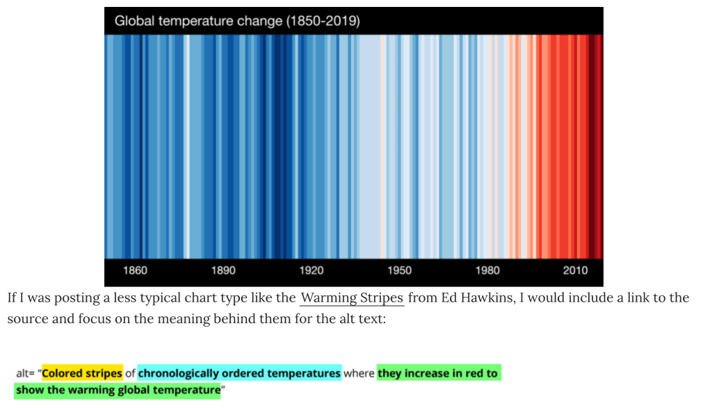
Use tools like the HTML longdesc attribute to link to a detailed explanation, or include an extended description within the surrounding content. Also consider providing access to the underlying dataset, enabling readers to explore and interpret the data independently. And, for abstract designs like climate stripes or network diagrams, describe the intended takeaway rather than the specific visual details (I am so guilty of leaning the latter).
Since data visualizations can be placed in many “containers”, we need to ensure we’ve covered the bases in each.
In a web context, use — at a minimum — alt="" and longdesc="" whenever possible. For social media, most platforms support alt text on attachments, so make good use of them when you can.
I haven’t checked gDocs (I try hard to not use gDocs), but I do know various components of both Apple’s and Microsoft’s office suites support adding accessible descriptions to embedded content.
Amy has tons more advice. I suspect many of us (at least me) would do well to set some 2025 resolutions based on both this post and Sarah’s post.
Accessibility Assistance From AI
I’m keeping this section short due to the length of the previous two sections and also due to fact that I know some readers (and, many humans in general) have valid personal ethical problems using any LLM/GPT/etc. for any content generation.
Advancements in large language models (LLMs) have opened new avenues for enhancing the accessibility of data visualizations. Tried-and-ture methods, such as alt text and data tables, can still often fail to convey the full depth of visualized data. Decent work is being done in the LLM space to help generate more comprehensive and interactive descriptions, improving the accessibility of complex visual information. Let me point y’all to two of them.
One notable project is VizAbility, a system that enriches chart content navigation with conversational interaction. By integrating an LLM-based question-and-answer module, VizAbility lets folks explore data trends and visual patterns through natural language queries. This approach not only provides detailed descriptions but also facilitates verbal command-based chart navigation, making data visualizations more accessible to blind and low-vision (BLV) humans. 
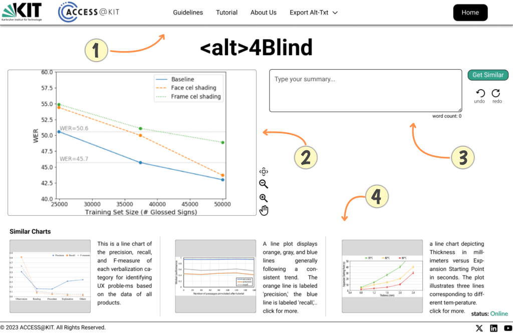
Another interesting one is Alt4Blind, an interface designed to simplify the creation of alt texts for charts. This tool retrieves high-quality alt texts from similar chart images, offering references that assist creators in crafting accurate and informative descriptions. By employing deep learning models to rank and retrieve semantically similar charts, Alt4Blind ensures that the generated descriptions are both relevant and precise, enhancing the accessibility of visual content.
If you know of others, (pls) shoot them to me wherever you’re most comfortable.
FIN
We all will need to get much, much better at sensitive comms, and Signal is one of the only ways to do that in modern times. You should absolutely use that if you are doing any kind of community organizing (etc.). Ping me on Mastodon or Bluesky with a “🦇?” request (public or faux-private) and I’ll provide a one-time use link to connect us on Signal.
Remember, you can follow and interact with the full text of The Daily Drop’s free posts on Mastodon via @dailydrop.hrbrmstr.dev@dailydrop.hrbrmstr.dev.
Also, refer to this post and this post to see how to access a regularly database of all the Drops with extracted links, and full text search capability. ☮️

Leave a reply to hackcaster Cancel reply