Font Projector; Because They’re Made Of Wood?; Featured Free Font: LCT. Sinar
Your friendly neighborhood hrbrmstr was a tad under the weather Monday (so, no Drop), as it seems even the slightest cold now fills the lungs up pretty good for a bit thanks to our long covid pals.
There should be plenty of fun in today’s typography-centric edition to make up for yesterday.
TL;DR
(This is an AI-generated summary of today’s Drop using Sonnet via Perplexity.)
Here’s a concise three-bullet summary of the blog post:
- The FontJoy Embedding Projector (https://fontjoy.com/projector/) is a visualization tool for exploring font data and finding pairings, using techniques like PCA and t-SNE to reduce high-dimensional font data to 2D or 3D representations.
- The Pouchée alphabets, created by Louis John Pouchée in the 1820s, were thought to be lost in a fire but were later rediscovered. More details can be found at https://www.typeroom.eu/article/louis-john-pouch-e-s-lost-alphabets-are-most-beautiful-types-ever.
- LCT. Sinar (https://github.com/Lokal-Container/Sinar) is a contemporary reverse contrast variable font designed by Fadl Haqq and released by Lokal Container Tipografi, available for free personal and commercial use.
Font Projector

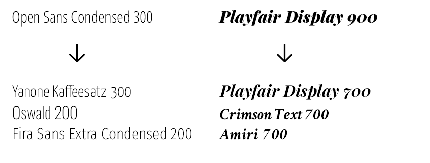
As we’ve noted in a few TT Drops, picking fresh font combos can be a fairly difficult task. The FontJoy Embedding Projector (FJEP) is a neat visualization tool for both exploring high-dimensional font data, and finding font pairings. It lets us interactively visualize and analyze font embeddings in a 2D or 3D space, and employs techniques like Principal Component Analysis (PCA) and t-SNE (t-Distributed Stochastic Neighbor Embedding) and sampling to reduce the high-dimensional font data to a manageable representation.
While it comes with its own data, it also supports upload our own data (there are 1883 different fonts in the dataset), since it’s “just” a TensorBoard instance.
The font embeddings were created by first turning the fonts into images using a grid of “important” letters:

Similarity search is one of the basic use-cases:

But, vector arithmetic actually works pretty well too!

Normal distance metric algos weren’t sufficient, so they invented a “contrast similarity” metric, which is a fancy term for the cosine distance split into two halves — the positive bits and the negative bits.
It’s not perfect, but it is a neat alternative way to find that perfect pairing.
Because They’re Made Of Wood?¹

If you get bitten by the “font bug”, you usually start to poke at the history of particular fonts, and soon become lost in the rich history of designers and foundries. As I started to do my own digging, one of the things that came as a pretty big surprise to me was how cutthroat and downright dastardly many typographers and foundries were (and, perhaps, still are?).
Another discovery that still engenders a “Huh?!” to this day (for each new story I find) is that the physical fonts of yore were often lost, melted, broken, or, burned.
Burned?
Yes, burned. 🔥
Sorts were generally made metal or wood. Metal was great for smaller typefaces, but wood was lighter and far more economical for large, and large + fancy typefaces. It’s also more durable (large metal sorts had a tendency to crack after being poured and cooled).
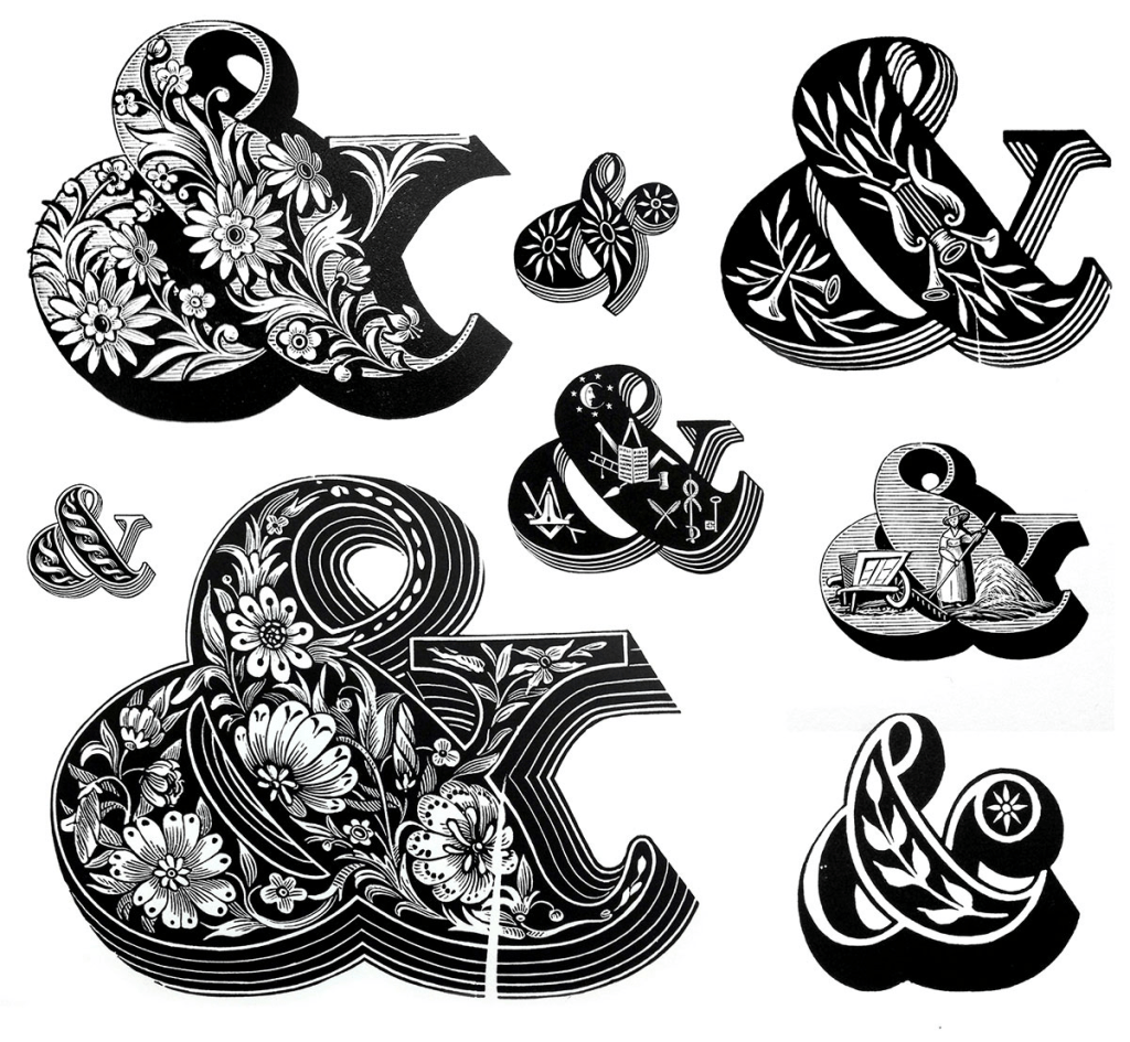
One set of typefaces that are described by most hardcore type nerds as the most ambitious and most beautiful types created in wood in any period are the Pouchée alphabets. A sample of them is in the section header.
These intricate letterforms were created in the early 1820s by Louis John Pouchée. They eventually became the property of H.W. Caslon & Co. (yes, that Calson), and — at some point — that foundry failed to keep up with printing technology trends, and also failed to produce innovative type designs. That, combined with healh issues, forced them to close in 1936.
Their inventory of sorts, punches, and matrices made their way to a few foundries, and Monotype ended up with these ornate alphabets. Shortly thereafter (1940), they experienced a fire in their London offices. In the long run, it turns out they just “misplaced” these glyphs, but everyone thought the Pouchée alphabets were lost in the fire.
Thankfully, some intrepid individuals did some digging in Monotypes physical inventory in the ’60s and discovered that they were fully intact. They’ve since been digitized, and the physical sorts transferred to the University Press in Oxford and later to the St. Bride Printing Library.
I’ve just touched lightly on the Pouchée alphabets, here, as I really want to encourage you to read this (it also has a short video on the alphabets); and, this, as they’re written by proper typographers who convey the rich history of these display fonts much better than I can.
Featured Free Font: LCT. Sinar

LCT. Sinar is a contemporary typeface designed by Fadl Haqq and released by Lokal Container Tipografi (LCT), an independent open-source type foundry. It’s technically described as an “aesthetic reverse contrast variable font with a confident and contemporary style”. Reverse contrast fonts are characterized by having thicker horizontal strokes than vertical ones, which is the opposite of traditional typeface designs.
While it doesn’t have tabular numbers, I’m going to try this out when I make new random datavis projects.
It includes eight static styles, and is free for personal and commercial use.
¹ Reference hint for the youngsters out there.
FIN
Remember, you can follow and interact with the full text of The Daily Drop’s free posts on Mastodon via @dailydrop.hrbrmstr.dev@dailydrop.hrbrmstr.dev ☮️
Leave a comment