That Font?! In This Economy?; Font Prompt
Apologies for no Monday Drop, it’s partly due to some reading I did for the second (only two this time) section. Work’s also crazy town, again, this week, and it will likely mean no Wednesday Drop as well.
TL;DR
(This is an AI-generated summary of today’s Drop using Sonnet via Perplexity.)
- Eco fonts, designed to reduce ink consumption and environmental impact, can save significant resources in printing. Examples include Ecofont (up to 50% ink savings), Ryman Eco (33% less ink), and NIV Comfort Print. HarperCollins has demonstrated real-world savings using these fonts. [https://www.ecofont.com]
- AI-driven font recommendation systems are emerging to simplify font selection. A new tool at [https://deblank.com/fonts] uses AI to suggest fonts based on prompts. Recent research, such as “Implementing and Evaluating a Font Recommendation System Through Emotion-Based Content-Font Mapping,” explores emotion-based font mapping for more effective recommendations.
That Font?! In This Economy?
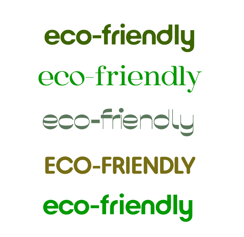
Despite a slowdown in the rate of inflation, shrewd producers and consumers are still pinching pennies wherever possible. And, if one hasn’t noticed, we’re burning through our earthly resources at a staggering pace. Perhaps our venerable typefaces could be used to help reduce the resources needed when need to print out our creations?
It turns out, they can!
“Eco fonts” are typefaces specifically designed to reduce ink consumption and minimize the environmental impact of printing. These are super innovative fonts, and they hope to address the growing concern over resource waste and carbon emissions associated with traditional printing practices. By incorporating clever design elements, eco fonts can significantly reduce ink usage while maintaining readability.
One of the pioneering eco fonts is Ecofont, developed by the Dutch company SPRANQ. Ecofont’s design features tiny holes within each character, which are imperceptible at small sizes but reduce ink coverage. According to independent tests, it can achieve ink savings of up to 50% compared to normal printing. The Ecofont software can also apply this hole-punching technique to other fonts, with a reproducible test showing 28% ink savings when applied to Arial.
Ryman Eco, launched by the UK stationery firm Ryman’s, is another notable eco font. It uses thin lines to create hollow shapes within characters, relying on ink bleed to fill the gaps when printed at small sizes. Ryman Eco claims to use an average of 33% less ink than standard fonts. The font’s creators estimate that if everyone used Ryman Eco for printing, it could save 490 million ink cartridges, 15 million barrels of oil, and reduce annual CO2 emissions by up to 6.5 million tonnes (I never remember if a UK tonne is the same as ours, so I left the UK spelling).
NIV Comfort Print is another example of an eco fonts designed to reduce ink consumption. While specific savings data for it are hard to come by, this particular font could have a big eco impact, given the number of bibles printed each year.
All the articles I scanned through noted that the effectiveness of eco fonts can vary depending on the printing method and font size. For instance, a study on English and Thai eco fonts found that the Ecofont version of Century Gothic reduced ink consumption by 25%, while the Ecofont version of Times New Roman achieved a 12% reduction. The same study confirmed that Eco Vera Sans reduced ink use by up to 28%, consistent with previous research.
If you’re hooked on old-school fonts, you’ll be pleased to know that Garamond, Century Gothic, Times New Roman, and Courier are all fairly eco-friendly.
Now, the most obvious eco-savings for these fonts is in an everyday office printing setting where folks output tonnes of text-heavy documents. Design-intensive projects will almost certaily focus on the “design” vs. the “eco”, but the volume is also generally much lower.
If you don’t believe academia and industry, check out how much HarperCollins saved IRL.
Font Prompt

Ever stared at your screen, agonizing over which font to use for what you’re working on? While I tend to stick with some fav fonts, when I decide to expand my horizons for a new project, I can 100% spend quite a bit of time trying to find a new one. It turns out that “AI” is stepping in to make this process a tad bit easier.
For starters, here’s a new tool that uses a custom AI overlords to help pick a font based a prompt. There aren’t many details on how it was trained, etc., so we’ll first focus on getting the most out of this tool, then take a peek behind the curtain on how AI-driven font recommender systems work through the lens of a recent paper.
For the tool, I highly suggest using another tool to create a prompt for it. I’ve been doing that in general, more recently, since LLMs are already “garbage out” enough on their own, and will do an even poorer job with garbage input (i.e., a terrible prompt).
As an aside, I’ve noticed most of the popular LLM/GPTs are doing this behind the scenes, now, but it doesn’t hurt to put some effort in to ensure more consistency in operations.
I was super lazy in coming up with the example that created the output in the section header. Here’s the prompt I fed into Perplexity (selecting Sonnet as the model):
give me a good prompt for an AI tool that recommends fonts. i want a nice font for a minimalist blog.
Here’s the seriously improved prompt it provided:
Recommend a clean, modern font suitable for a minimalist blog. The font should be highly readable on screens, work well for both headings and body text, and convey a sense of simplicity and elegance. Consider sans-serif options that pair well with ample white space.
I fed that in, and the AI tool generated a respectable list. You can refine or regenerate the selections.
After coming across the site, I wanted to know more about how these systems might work, and came across “Implementing and Evaluating a Font Recommendation System Through Emotion-Based Content-Font Mapping”. It’s quite readable for an academic tome, and focuses on systems that suggest fonts based on “emotion-based content-font mapping”; i.e., systems that suggest typefaces that align with the emotional context of given content, thereby enhancing our experience and increasing the efficacy of what’s being communicated.
The paper’s researchers developed a methodology to quantify font emotions using a set of 19 carefully selected keywords applicable to Korean fonts. This approach allowed for a nuanced understanding of the emotional attributes conveyed by different typefaces.
Their work also involves two calculation models. One uses the “Pleasure-Arousal-Dominance (PAD) emotional model“, while the other performed correlation analysis between the emotional classification criteria. After comparative evaluation, the correlation-based approach proved more effective, so they chose that the final recommendation system.
The team validated their system via usability evaluations, which confirmed both the appropriateness of font recommendations and the overall efficiency of the implementation compared to existing systems.
Obviously, this isn’t the only work being done in this recommender space! Researchers at UCF (as part of their work in the Readability Consortium — an organization we’ve covered before in the Drop) built FontMART. It, understandably, focuses on readability, and their model learns to associate fonts with specific reader characteristics. FontMART was trained with a remote readability study of 252 crowd workers and their self-reported demographic information.
It can predict the fonts that work well for specific readers by understanding the relationship between font characteristics and reader characteristics like font familiarity, self-reported reading speed and age, according to the FontMART study. Among the characteristics considered, age plays the largest role when the model determines which font is recommended for readers. The summary is very accessible, and the model is also accessible here.
We’ll almost certainly take a look at other recommender models in subsequent TT Drops.
FIN
Remember, you can follow and interact with the full text of The Daily Drop’s free posts on Mastodon via @dailydrop.hrbrmstr.dev@dailydrop.hrbrmstr.dev ☮️

Leave a comment