The Readability Consortium; Proof Positive; Featured Free Font: Colorfiction
Some fun and unusual typographical topics await intrepid readers today!
TL;DR
(This is an AI-generated summary of today’s Drop using Sonnet via Perplexity.)
NOTE: it failed to extract and include links for the first time in a while.
- The Readability Consortium, a collaboration between Adobe, Google, UCF, and Readability Matters, is conducting research to personalize digital reading experiences. Recent studies show up to 35% increase in reading speed with optimal fonts.
- Hoefler & Co.’s “Proofs” project provides comprehensive proofing documents and insights for evaluating typefaces during development. Their blog emphasizes the importance of selecting appropriate text for effective font proofing.
- Colorfiction offers a collection of nine hand-drawn/sketched fonts, including variations like Casual, Gothic, and Papyrus, available for free use in projects.
The Readability Consortium
One of the main goals in typesetting a portion of text is so folks will, well, read it. We’ve touched on topics regarding how to make texts readable, but did you know there’s a whole consortium focused on this goal?
The Readability Consortium, a collaboration between Adobe, Google, the University of Central Florida (UCF), and nonprofit Readability Matters, is spearheading research to personalize digital reading experiences. Their work challenges the notion of a universal approach to typography, instead focusing on how font characteristics can be tailored to individual readers.
Recent studies by the consortium have yielded promising results. In one experiment, readers demonstrated up to a 35% increase in reading speed when using their optimal font, without compromising comprehension. A joint study by Adobe Research and Brown University found that participants read 35% faster with their fastest font (314 words per minute) compared to their slowest (232 words per minute on average).
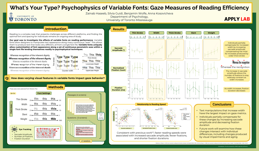
As we’ve noted in more than a few Drops, variable fonts allow a single font file to dynamically adjust characteristics like weight, width, and slant. This technology enables more flexible, personalized reading experiences across digital platforms. And, the consortium is all in on variable fonts, with multiple projects investigating the “psychophysics” of them. Psychophysics quantitatively investigates how physical stimuli relate to sensory experiences and perceptions. It aims to measure and analyze the connection between the physical world and our psychological responses to it. They’ve tacked a few analysis angles in this space, and you can pore over a larger version of the section header right here, and a different readout here.
To translate research into practical applications, the consortium is developing tools to help readers identify their optimal reading format (we covered that in a previous Drop). One such tool, reminiscent of an eye exam, determines a reader’s “prescription” by testing various fonts, sizes, and spacings. The goal is to create a system that automatically applies these preferences across devices.
The consortium is also harnessing artificial intelligence to advance their work. Scientists from Adobe and UCF have developed a machine learning model that recommends personalized fonts to enhance reading speed and accessibility.
The implications of this research extend beyond individual reading experiences. It could truly help revolutionize e-learning materials, improve workplace document readability, and enhance digital content accessibility. As the Readability Consortium’s work progresses, we may see a future where digital text adapts to the reader, rather than vice versa, potentially making reading faster, easier, and more accessible for diverse populations.
There’s lots to explore on their site, so def take some time to check it out!
Proof Positive

As y’all know, typography plays a crucial role in design. But did you also know that one of the most important aspects of creating a typeface is the proofing process. Hoefler & Co., a well-known type foundry, has made significant contributions to this field with their “Proofs” project (GH) and insights on text for proofing fonts. This project provides a comprehensive set of proofing documents that help designers evaluate and refine their typefaces during the development process.
In it, you’ll find a collection of InDesign templates, various text samples for different proofing purposes, and scripts to automate certain aspects of the proofing process. They’re designed to assist type designers in thoroughly testing their fonts, ensuring consistency, readability, and overall quality across different contexts and use cases. But, there’s nothing stopping you from seeing how your fav fonts stand up to scrutiny!
Their blog goes into more detail about how to select appropriate text for proofing fonts. Yes, that means the choice of text can significantly impact the effectiveness of the proofing process. They emphasize that one should use text that covers a wide range of letter combinations, includes both uppercase and lowercase characters, and incorporates numerals and punctuation marks. They further stress that one should select text that mimics real-world usage scenarios (which seems kind of obvious, but how many of us still rely on that speedy reynard for samples?). They even have specific examples you can walk through.
Even though you’re likely not a type designer, getting some insight into what went into making that fav typeface you 💙 so much can help develop a deeper appreciation of both the crafter and craftsmanship.
Featured Free Font: Colorfiction
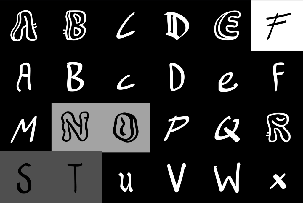
As someone who can’t draw a straight line without Omnigraffle (or R) around, I’m kind of in awe with this collection of hand drawn / sketched / written fonts. Nine core typefaces (some with variations) come in the tin:
- Colorfiction Casual (Freeform)
- Colorfiction Emphasis (Freeform & Regular)
- Colorfiction Gothic (Freeeform & Regular)
- Colorfiction Juice (Freeform & Reglar)
- Colorfiction Juice 2
- Colorfiction Messy
- Colorfiction Papyrus
- Colorfiction Simple
- Colorfiction Sketch
and they’re all gorgeous.
FIN
Remember, you can follow and interact with the full text of The Daily Drop’s free posts on Mastodon via @dailydrop.hrbrmstr.dev@dailydrop.hrbrmstr.dev ☮️

Leave a comment