The Typography Of Dates, Times, & Filenames; FontCDN; Featured Font: Classic Console Neue
Programming Note: $WORK has declared tomorrow a holiday and the Drop will be following suit, so we’ll catch you back on Thursday.
The Typography Of Dates, Times, & Filenames

While I think I subconsciously made some of the same choices as the author of the resource featured in this section, I never quite thought of typography when working with filesystem or application file-picker GUIs in quite the deliberate fashion Dale de Silva did in a recent post.
He discusses the importance of designing effective file naming conventions, particularly for chronological browsing and syncing across different machines and cloud services. He also shares his experience in developing a file naming format for the Obsidian handwriting plugin, Ink, which automatically creates and embeds files for handwritten sections in notes.
Some deliberate choices include:
- Minimal Length: Filenames should be as short as possible to avoid truncation in file managers.
- Understandable at a Glance: Filenames should be instantly recognizable and informative.
- Scannable: Filenames should be easy to browse in bulk.
Dale emphasizes using a date format that orders chronologically when sorted alphanumerically, recommending the format YYYY-MM-DD (only monsters choose other forms). Dale also discusses the challenges of differentiating multiple files created on the same day, suggesting appending times in HH-MM format and, if necessary, adding a number in parentheses for files created in quick succession (I’m not a fan of this choice).
The post further explores various characters for separating date and time elements, ultimately favoring periods and hyphens for readability and cautions against using month names due to increased filename length and potential confusion.
I think spending some time coming up with your own, deliberate choices is worth the effort, but I also hope you land on a better final choice than Dale did. Personally, I prefer YYYY-MM-DD and YYYY-MM-DD-HH-MM if I need to get more granular (friends don’t let friends use periods, spaces, slashed, or parentheticals in file/directory names).
FontCDN

Google Fonts is already pretty easy to use, but that doesn’t mean the UX cannot be improved to help you find the font you want/need even faster than you already can. Thomas Park built FontCDN (GH) to do just that!
You can fine-tune a search, or toggle various selections to see samples of all the matching fonts at once so you can pick one and get on with your project.
The source for the web app is provided, and it’s a pretty nice example of a fairly diminutive React application.
Featured Font: Classic Console Neue

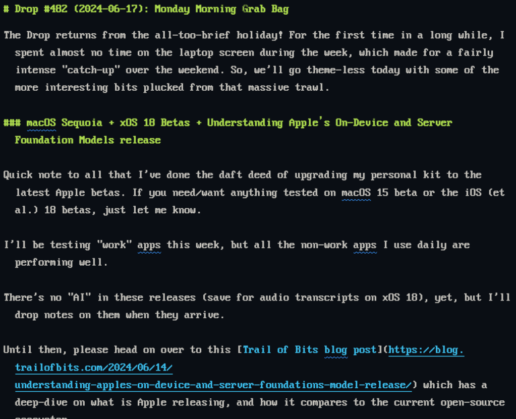
The Classic Console Neue font, also known as Classic Console v2, is a TrueType font designed to replicate the original 8×16 ASCII console fixed-width font. This font includes a wide array of code pages, covering Latin, Cyrillic, Greek, Hebrew, Braille, Armenian, Georgian, Ethiopic, Turkish, and more, totaling 4100 glyphs. It is particularly useful for command-line interfaces, IDEs like VS Code, IntelliJ, WebStorm/PHPStorm, and other source code editing tools. The font is best viewed at 12pt (16px) and is licensed under the MIT License.
It has:
- Extensive Glyph Support: Covers multiple languages and scripts, making it versatile for various coding and documentation needs.
- Retro Aesthetic: Emulates the look of old console terminals, VGA BIOS, and MS-DOS fonts, appealing to those who appreciate a vintage computing feel.
- Wide Compatibility: Suitable for use in command-line tools, FAR Manager, Putty, and various IDEs.
and def makes me want to dig out my Atari and play some old games.
FIN
Remember, you can follow and interact with the full text of The Daily Drop’s free posts on Mastodon via @dailydrop.hrbrmstr.dev@dailydrop.hrbrmstr.dev ☮️
Leave a comment