Building OpenType Math Fonts; The Comic Sans Of The 70s; The Periodic Table of Typefaces
Some more long-form sections, today, that may be just involved enough to carry y’all through next Tuesday when the Drop is on holiday.
Building OpenType Math Fonts
We make many assumptions and take for granted many defaults when we use these modern, glowing rectangles of ours. One of those is how glyphs are rendered. I should say “was”, as we’ve explored the in’s/out’s of many of the technical details of various aspects modern font file formats and how they’re rendered. One which we have not explored is how math symbols are treated in this context.
As most readers likely know, Noto fonts is an open-source project aimed at creating high-quality fonts that support all languages and scripts. The “math” GitHub repository within the Noto organization focuses specifically on mathematical fonts. These are specialized fonts designed to handle the unique requirements of mathematical notation. Unlike regular fonts, math fonts must support a wide range of symbols, operators, and formatting options. They are used in academic papers, textbooks, and digital documents to ensure that mathematical expressions are displayed correctly and consistently.
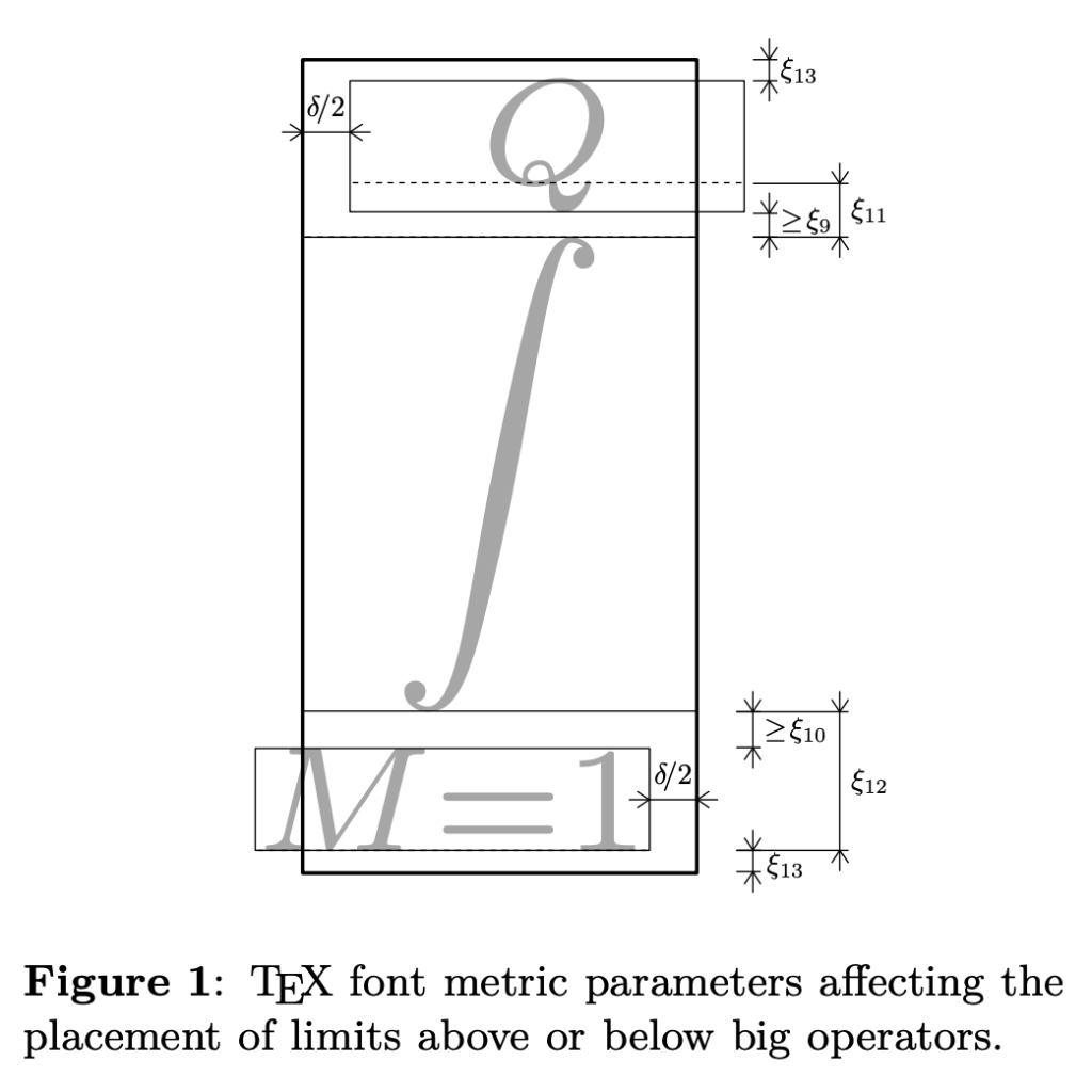
The Noto team put together a “Building OpenType math fonts” article to help explain why math glyphs are special, and how they work.
One of the main differences — and complexities — of these specialized glyphs is due to the two-dimensional arrangement of math formulas and the interaction between symbols of different styles and sizes. OpenType math fonts address these challenges by containing all math symbols in a single font, using dedicated Unicode codepoints, and including additional glyphs required for math layout in the MATH table. The MATH table stores various font-wide parameters and glyph-level data that control different aspects of math typesetting, such as positioning of superscripts, subscripts, accents, and delimiters. Editing the MATH table can be complex, but many tools provide interfaces to adjust these settings.
It’s a seriously cool piece that’s worth the time to pore over, especially if you’ve never given great consideration to the rendering of equations and formulae.
The Comic Sans Of The 70s
What if I told you there was a font that has — historically — been almost equally reviled as Comic Sans?
Don’t believe me?
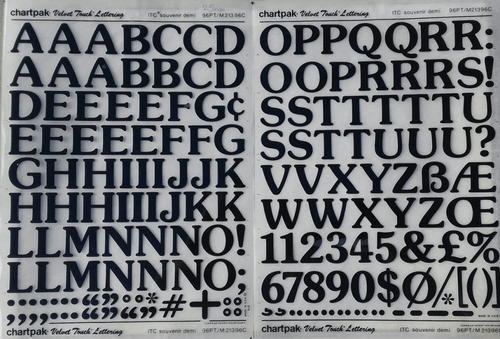
Well, then, allow me to introduce you to Souvenir.
The original design philosophy was to craft a typeface that functions as a meaningful “memento”, of sorts; one that, say, captures the essence of a journey and elicits special memories and feelings for the reader. Unfortunately, it turns out to be a font some discerning designers just wish to forget.
It was designed in 1914 by Morris Fuller Benton (srsly! def check out that wiki entry) and later revived by Ed Benguiat.
Benton created the typeface during his tenure as head of the design department at the American Type Founders (ATF). Souvenir was characterized by its rounded serifs and soft, rubbery look, with minimal contrast between thick and thin strokes. Despite its unique design, it did not achieve widespread popularity in its early years, partly due to its limited range of sizes and lack of italic versions.
Fast-forward to the 1960s when the aforementioned Benguiat adapted Souvenir for phototypesetting by the International Typeface Corporation (ITC), adding new weights and styles, including italics and swashes. This redesigned version, known as ITC Souvenir, was released in 1971 and quickly gained popularity, becoming nigh ubiquitous in the 1970s. It fit in well with ITC’s signature design formulary of high x-height and multiple widths and weights.
If you were conscious (and, sober) during the 70s, some documented uses of Souvenir should bring back a memory or two.
The overuse caused some creative derision:
- Simon Garfield, type historian, called Souvenir the “Comic Sans of its day”.
- Guy Romano, a 1990s type critic, memorably said of Souvenir: “We could send Souvenir to Mars, but there are international treaties on pollution in outer space.”
- Allan Haley, in his 1990 book “ABCs of Type”, described Souvenir as “like Times New Roman dipped in chocolate” — implying it was a bit cloying.
- Mark Batty, former CEO of ITC itself, loathed Souvenir, calling it a “terrible typeface” and “a sort of Saturday Night Fever typeface wearing tight white flared pants.”
- Erik Spiekermann, type designer, said, “Souvenir was very typical for the 70s” and that it was “a little overdone like most ITC faces at the time.”
- Nadine Chahine, type designer formerly of Monotype, acknowledged that “designers like to hate this typeface”.
If you’re one of the folks who actually likes the font (or just likes torturing folks), Fraunces (GH) comes pretty close, and is free to use.
The Periodic Table of Typefaces

A creation of Camdon Wilde, the components of this table come from various sources noted on the image (though many, now, 404).
It groups typefaces into categories or “families” such as serif, sans-serif, script, blackletter, and more, similar to how the periodic table groups elements into groups and periods.
There is, unfortunately, no ryhme or reason to the order in the table. It was just used as a design reference.
Still, I — for one — cannot resist a periodic table layout, and figured there were other such folks out there.
FIN
Remember, you can follow and interact with the full text of The Daily Drop’s free posts on Mastodon via @dailydrop.hrbrmstr.dev@dailydrop.hrbrmstr.dev ☮️

Leave a comment