The Hidden Power Of Typography ; Typography For Lawyers; Game Font Forensics
Today, we have a diverse array of typography-related topics, ranging from the key role typography plays in our online/app experiences, to how there are most certainly “rules” when it comes to typography in the context of certain professional settings, to the truly wonderful world of typography in video games (especially ancient games).
TL;DR
(This is an AI-generated summary of today’s Drop.)
(I, clearly, have to re-visit my prompt, as we’re back in “no link” land on multiple days.)
- The Hidden Power Of Typography: This section delves into the significant impact of typography on user interface design, emphasizing its role in readability, emotional response, and user behavior. Rob McKaughan’s article on Microsoft’s Design site provides examples demonstrating how typography influences user engagement and interaction with digital products.
- Typography For Lawyers: Tailored for legal professionals, “Typography For Lawyers” by Matthew Butterick focuses on the importance of typography in legal documents for readability and professionalism. The book offers practical advice on font choice, spacing, and avoiding certain text formatting practices, with the aim of enhancing the clarity and persuasiveness of legal writing.
- Game Font Forensics: The article “Game Font Forensics” from
int 10hexplores the role of typography in video games, particularly in the context of ancient PC games. It discusses how game fonts serve as a link to the historical and developmental context of games, providing insights into the technological and creative constraints of the time.
The Hidden Power Of Typography

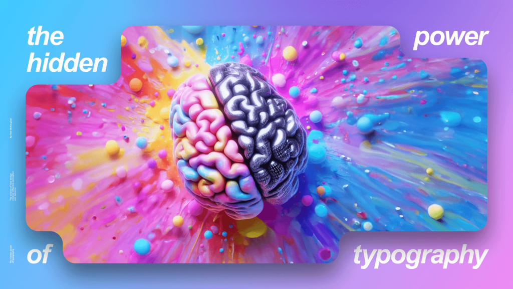
Typography is often perceived merely as the art of selecting and arranging type. Yet, it holds a transformative power in user interface (UI) design that extends far beyond “good looks”. It is a foundational element when one is looking to enhance user experience (UX), guiding user behavior, and reinforcing the cognitive aspects of design. In “The Hidden Power Of Typography” Rob McKaughan explores the hidden power of typography, and takes us on a journey to learn how it influences readability, user engagement, and overall interaction with digital products.
In a majority of settings typography must prioritize readability. The choice of typeface, font size, color contrast, and spacing can significantly affect how easily content can be consumed. Sans-serif fonts, for example, are often favored in digital contexts for their clarity and simplicity, which enhance legibility on various devices and screen sizes. This is not just a matter of preference but of accessibility. Good typography ensures that all of us humans, including those of us with visual impairments, can navigate and understand content effectively.
Typography also wields a subtle yet powerful influence on the human emotional response. The typeface chosen can evoke specific feelings — a robust, bold font may evoke a sense of confidence and strength, while a light, airy type might convey elegance and refinement. This emotional impact is crucial in identifying the content with the creator, as it helps to align the visual tone with identity and values (this is why you feel one way when visiting an Apple site vs. some random old-school GeoCities page).
Beyond readability and emotional engagement, typography can guide our behavior as we navigate content, sites, or apps. Deliberate use of typographic elements like size, color, and placement can draw attention to key areas of a website or application, directing our focus to important actions or messages. For instance, larger fonts can highlight calls to action, encouraging conversions, while varied typography can help create a hierarchy of information, guiding users through content in a structured and intuitive manner.
Typography also does not exist in isolation; it is an integral part of the design ecosystem. It interacts with other elements such as layout, color, and imagery to create a cohesive user experience. The alignment and spacing of type can affect the overall balance and harmony of the design, influencing how users perceive and interact with the content. A well-designed typographic setting not only enhances aesthetic appeal but also improves functionality and usability.
As digital landscapes evolve, so too does typography. The integration of dynamic and responsive typography, which adapts to various devices and orientations, is becoming increasingly important (we’ve covered this on a few occasions, here, in the Drop). Additionally, the rise of augmented reality (AR) and virtual reality (VR) technologies presents new challenges and opportunities for typographic design (though, Apple’s VR headset sales have stalled/tanked, so I’m not sure where we’ll be a year or two from now). In these immersive environments, typography must function in three-dimensional space and react to user interactions in real-time, pushing designers to innovate beyond traditional boundaries.
Hopefully this section has whet your appetite to head on over to McKaughan’s piece on Microsoft’s Design site where there are many fascinating example that put his assertions into practice (and, a few of them will make you look super smart in your office/Slack).
Typography For Lawyers

We covered another one of Matthew Butterick’s tomes last May, so it seems appropriate to cover this slightly modified version of his thoughts on good typography, now.
“Typography For Lawyers” is specifically tailored for legal professionals. It emphasizes the importance of typography in legal documents and how it can influence the readability and professionalism of such documents. The book covers practical aspects like choosing the right font, the appropriate use of spaces between sentences, and the avoidance of certain practices like underlining text. It also discusses the psychological impact of typography on readers, which is crucial in legal settings where documents need to be clear and persuasive.
As noted last year, “Butterick’s Practical Typography” has a broader audience in mind, extending its advice beyond the legal field to anyone interested in improving their typographic skills. This book covers a wide range of topics from basic typographic principles to more advanced concepts like page layout and font recommendations. It is designed as a comprehensive guide for improving the visual presentation of any written content. The book also includes sections on web typography, which is not a primary focus in “Typography for Lawyers”.
This legal-focused book talks about the specific needs of the legal profession, addressing common typographic pitfalls in legal documents and offering solutions that comply with the formal requirements of legal writing. It provides guidelines on font size, typeface choices (emphasizing readability and formality), and layout configurations that enhance the clarity of legal arguments.
While I (likely) have zero readers in the legal profession, I wanted to include this to give y’all a glance at what a discipline-focused typography book might look like. If you use Arc or Vivaldi, you can page through them (easily) side-by-side to see where the core differences are, and, you may just decide to apply some of the practices from the legal version in your own work.
However, I’d also like to challenge you to, perhaps, consider, drafting your own tome for your own discipline. With two guides to shape such a creation, you have the potential of leveling up the work produced in your field. At the very least, you will almost certainly help some fraction of work you must consume be a tad easier on the eyes.
Game Font Forensics

Typography in video games (a.k.a. “game fonts”), is an incredibly nuanced field that significantly impacts player experience and game design. The article “Game Font Forensics” from int 10h (which literally refers to a BIOS interrupt call in x86 assembly language, which is used for video services such as setting the video mode, getting the current video mode, and managing character and graphic functions on the screen) gives us a peek into the intricate world of fonts used in ancient PC games, revealing how these typographic choices are not merely aesthetic but serve as a bridge to the game’s historical and developmental context.
Game fonts, especially those from the era of bitmap fonts and early PC games, offer more than just visual appeal; they provide insights into the technological and creative constraints of the time. In their post, VileR discusses how fonts can act as “forensic evidence” in understanding the tools and methods used in game development. This aspect of typography is super cool as it connects seemingly unrelated games and uncovers hidden links between them, offering a deeper appreciation of the development process. (This post 100% scratched my “Columbo” itch).
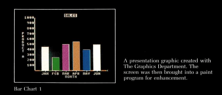
The use of specific fonts can reveal much about the era in which a game was developed. For instance, the article mentions the use of a “business and presentation graphics utility” that allowed developers to choose from twenty character fonts. This utility not only highlights the technological capabilities of the time but also the aesthetic preferences that influenced game design decisions. Such historical connections can help researchers/wonks grok the evolution of video game aesthetics and technology.
Understanding the choice of fonts in games also opens up discussions about developer intentions and the constraints they faced. The post points out that by examining the raw fonts through memory dumps treated as “1bpp data”, one can gain insights into the underlying architecture of the game as well as the creative decisions made by the developers. This approach is particularly intriguing as it shows how typography can serve as a window into the technical underpinnings of game design.
The exploration of game fonts extends beyond mere nostalgia or academic interest; it has practical implications for modern game developers and designers. By studying how fonts were used to overcome or work within technological limitations, today’s designers can learn valuable lessons in efficiency and creativity. Moreover, this understanding can inspire more thoughtful and innovative use of typography in modern games, where the choice of font can affect gameplay, user interface, and overall player engagement.
It’s a bonkers cool article with so many cool old-school graphics that you may be tempted to dust off an old Ninendo hand-held, or install an emulator on your fancy new workstation.
FIN
Remember, you can follow and interact with the full text of The Daily Drop’s free posts on Mastodon via @dailydrop.hrbrmstr.dev@dailydrop.hrbrmstr.dev ☮️
Leave a comment