Semi-Serifs; ztext.js; Using Type In AR & VR
It’s still early in 2024, which gives us all even more of an excuse to experiment and step out of our comfort zones. So, today we’ll cover an almost forgotten typeface style and also look at some potential new ways to think about fonts, now that Apple has entered the 3D ecosystem.
In other, non-font, news, Bluesky is still not GA, so here’s another code for folks to use bsky-social-zp3ar-euphk (the principle of precedence based on arrival)
Semi-Serifs

Semi-serif fonts, as the name suggests, are a hybrid category of typefaces that blend characteristics of both serif and sans-serif fonts. They are generally characterized by having some serifs, but not as many as traditional serif fonts. This unique combination of features makes semi-serif fonts versatile and suitable for a variety of applications, from headlines to body text.
The origin of semi-serif fonts is not as well-documented as that of their serif and sans-serif counterparts. They really came about as an evolution of typefaces over time. This blending of styles and features led to the emergence of hybrid categories like semi-serif. The first known sans-serif typeface appeared in a type sample book by William Caslon IV in 1816, and the style quickly gained popularity. Over time, designers began to experiment with these forms, leading to the creation of semi-serif fonts.
Semi-serif fonts offer a unique blend of the legibility of serif faces and the clean, modern aesthetics of their sans-serif counterparts. The presence of some serifs can enhance readability, especially at smaller scales, by helping to distinguish different letterforms. At the same time, the reduced number of serifs compared to traditional serif fonts can give semi-serif fonts a cleaner, more modern look.
They’re pretty versatile, too. They can work well in both headlines and body text, and their unique blend of features can add a distinctive touch to a design.
Some notable examples of semi-serif fonts include FF Max Demi Serif, ITC Syndor, and Rotis Semi Serif. FF Max Demi Serif, designed by Morten Rostgaard Olsen in 2003, is a Danish sans inspired by Aldo Novarese’s Eurostile (1962). The letter shapes in FF Max have rounder, friendlier forms, giving the typeface a certain human touch.
While those examples will cost you a bit of coin, NeverMind is free for both personal and commercial use. You can catch an example of it in the section header.
There’s never a better time than today to start experimenting!
ztext.js
Apple’s entry into the headset area may finally help usher in a new era of general spatial computing. Despite the cost, Apple does have enough “oomph” to force visionOS apps into the zeitgeist, or at least make a valiant attempt at doing so.
A potentially overlooked element of this new, third dimension is text. Most of the apps I used in my Oculus days relied on 2D text on the outermost part of 3D surfaces, and all of the examples I’ve seen in visionOS screencaps also show “flat” text.
We don’t need to settle for the status quo in this new canvas, and we also don’t need to be geometry experts to start experimenting.
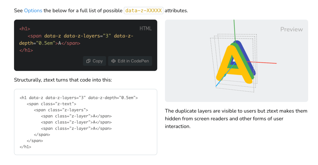
Bennett Feely’s ztext.js brings the world of 3D typography to the web. It works by giving the illusion of volume by creating layers from an HTML element. It’s like bringing the glorious days of WordArt into the modern web.
This library works by applying perspective and transforms to text, creating a 3D effect. It’s incredibly easy to implement. You simply need to include ztext.min.js on any site and initialize it with either JavaScript or HTML attributes. The library accepts various parameters, enabling us to customize the depth of the effect on the z-axis, the direction, the event type, the maximum rotation to be applied, and more.
It works with absolutely any font that works on the web, and it’s easy to integrate with CSS animations and transitions. Not only text, the library also supports images, SVGs, emoji, and even iconic fonts. This means we can apply 3D effects to just about any element in our digital creations.
A spiffy aspect of ztext.js is accessibility. The duplicate layers created by the library are visible to humans but are hidden from screen readers, ensuring that any website using these 3D fonts remains accessible.
Despite the fact that over 98% of folks use a web browser that supports the CSS transform-style property (which ztext.js needs to work), we shouldn’t just leave that 2% behind. Thankfully, in unsupported browsers, ztext.js gracefully turns off.
Finally, you can use it with just HTML attributes, via Vanilla JavaScript calls, or in React/Vue contexts.
You can peek at a very naive sample use of it here, and the documentation is very straightforward.
Using Type In AR & VR
This is a quick section since the site is designed for reference and education.
Google has a decent treatise on using typefaces in AR/VR contexts. It covers the following topics:
- Introducing AR/VR
- Designing for AR/VR
- Type selection for AR/VR
- Spatial classification of typography in AR/VR
- Technical challenges for typography in AR/VR
It’s worth absorbing even if you’re not presently hacking any projects in this space as many of the lessons learned do have some applicability in traditional creative spaces. And, you never know when some human will be experiencing your creations within this new medium.
FIN
Remember, you can follow and interact with the full text of The Daily Drop’s free posts on Mastodon via @dailydrop.hrbrmstr.dev@dailydrop.hrbrmstr.dev ☮️

Leave a comment